
Brand Identity · Campaign Direction
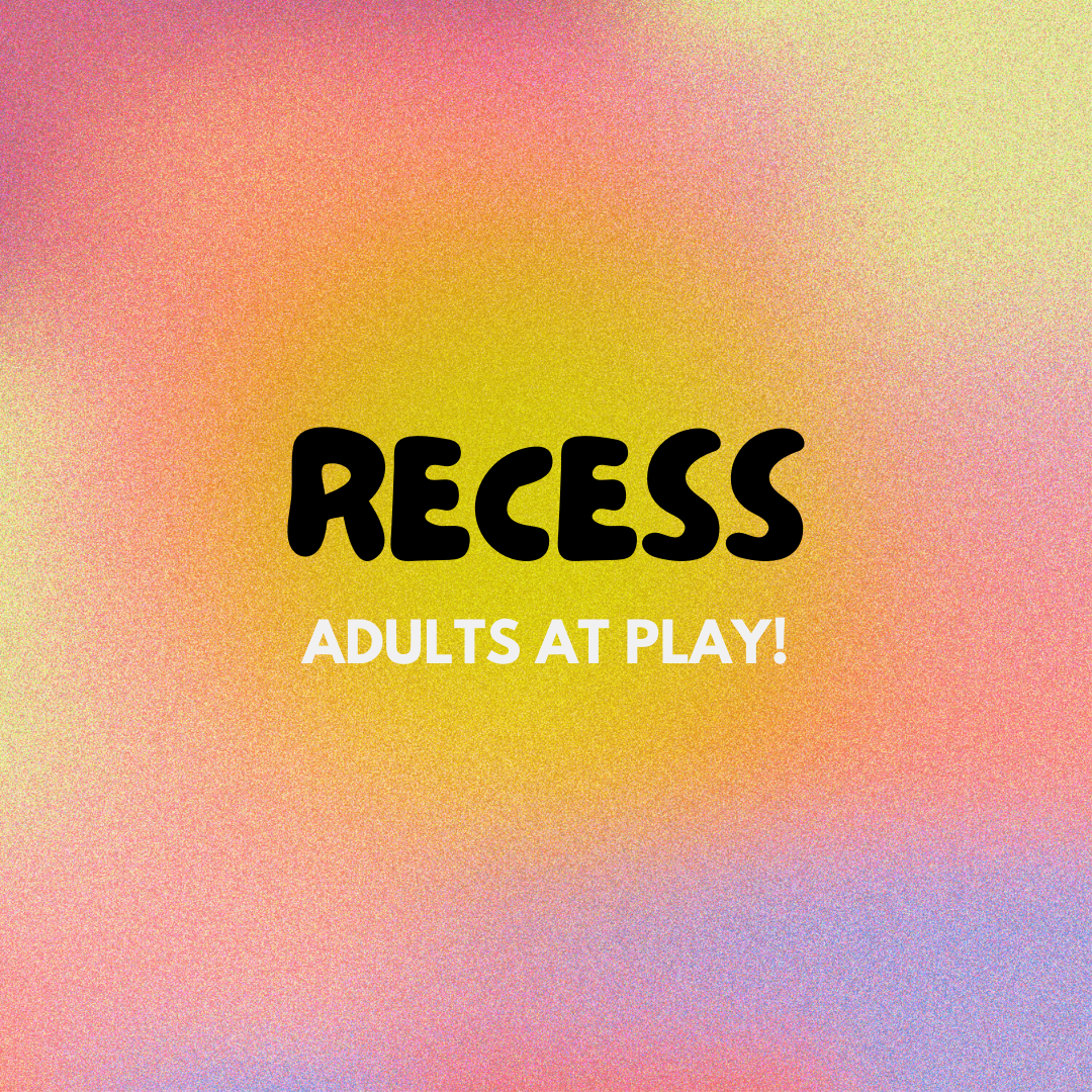
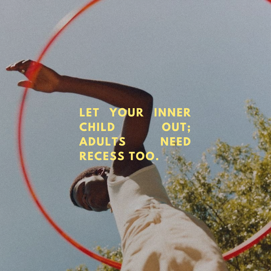
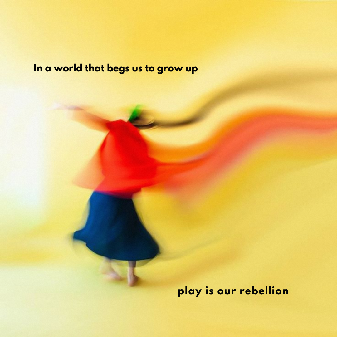
Recess:
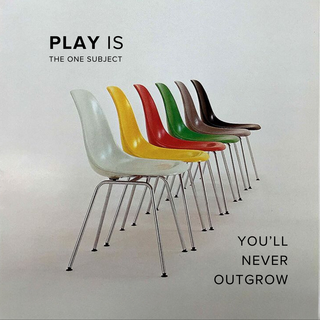
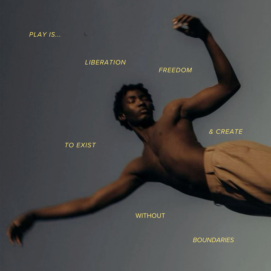
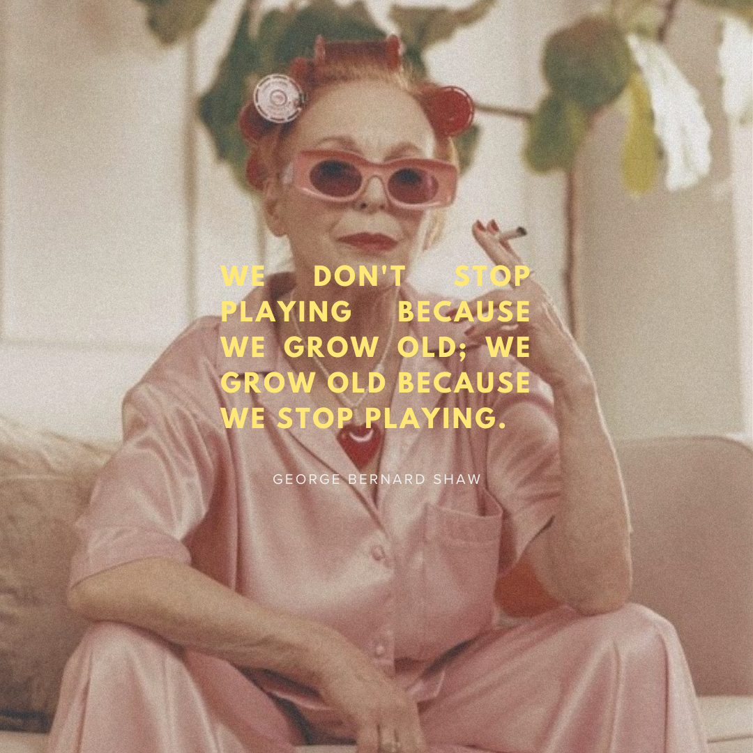
Adults at Play
A fully self-originated brand built around the concept of adults reclaiming play. Concept, identity, visual system, campaign direction, and photography, all originated here with no outside brief.
COLORS


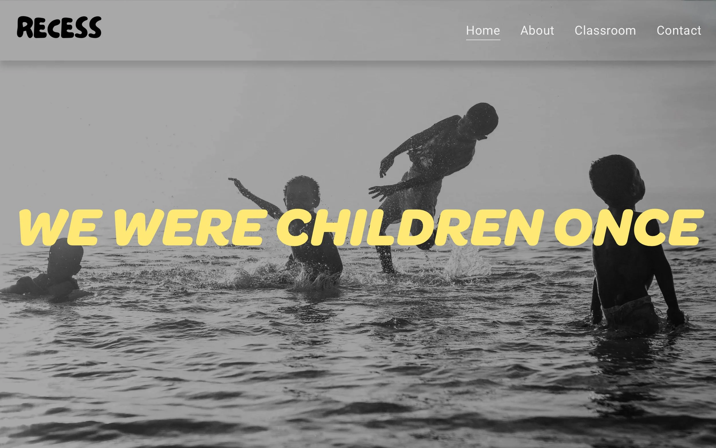
WEBSITE
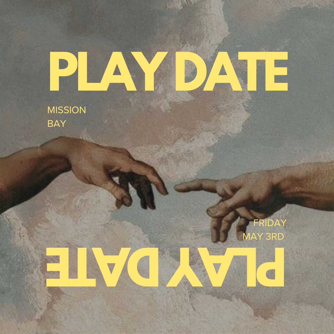
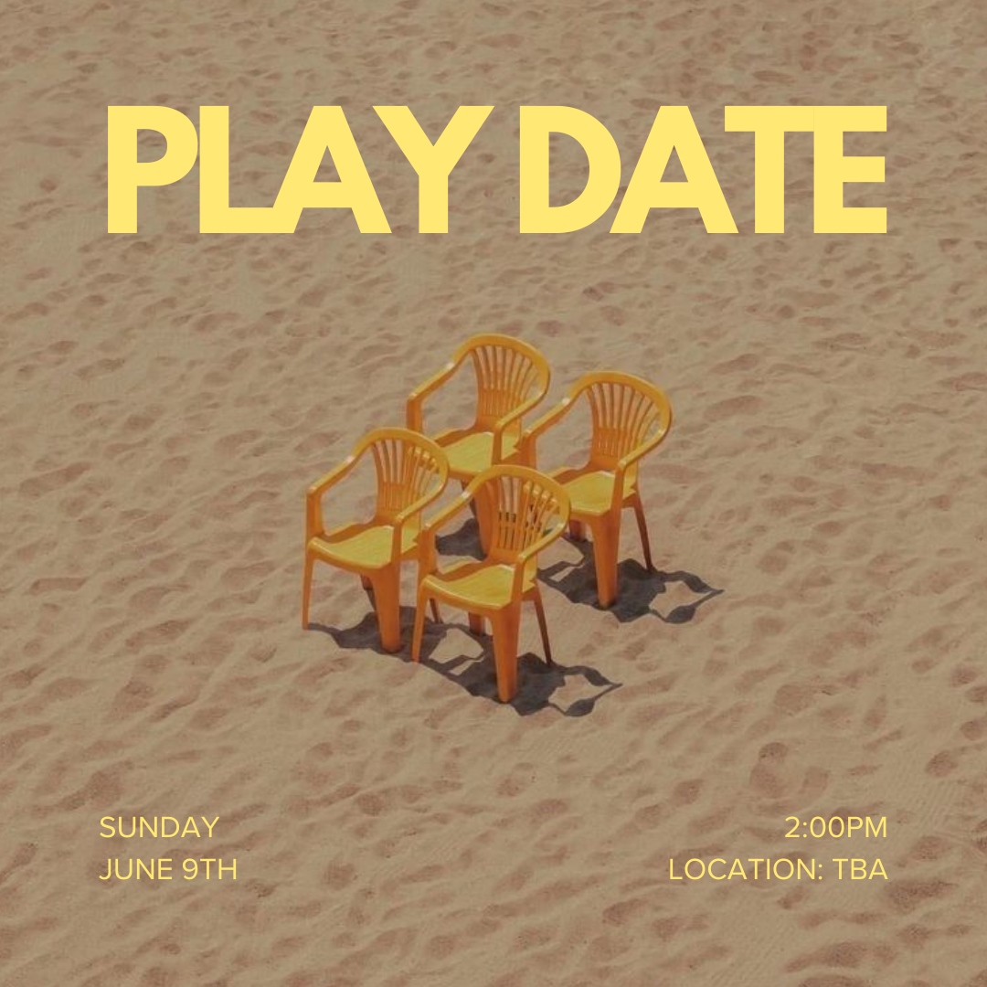
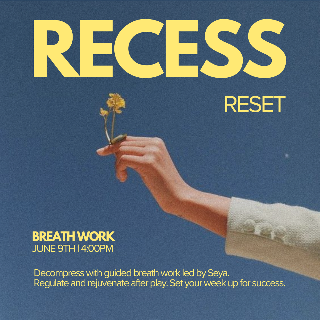
CAMPAIGN MATERIALS


SOCIAL CONTENT
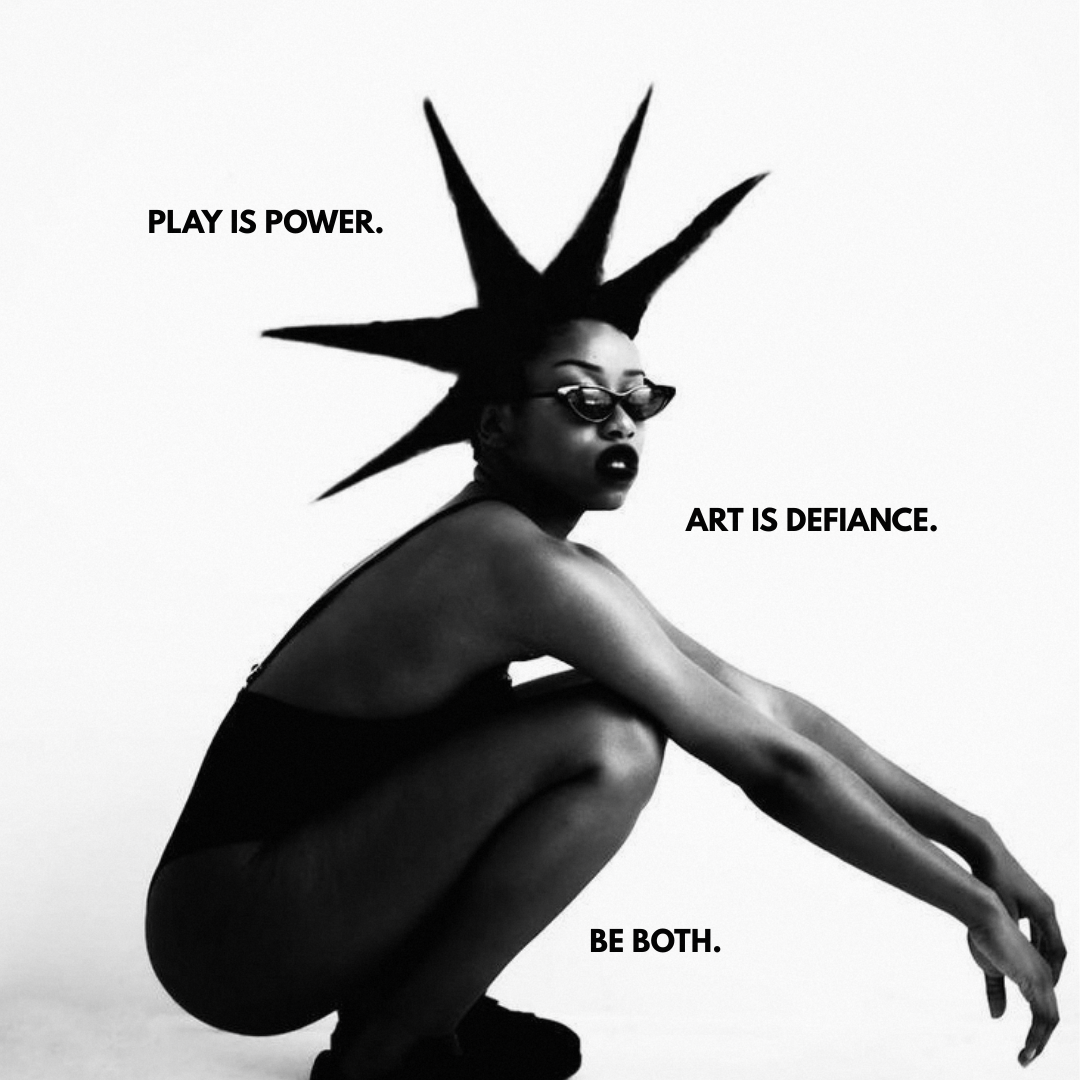
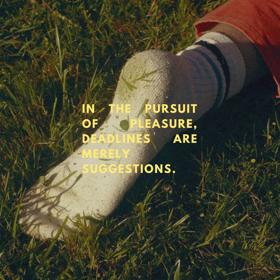
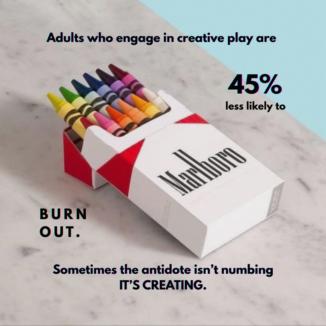
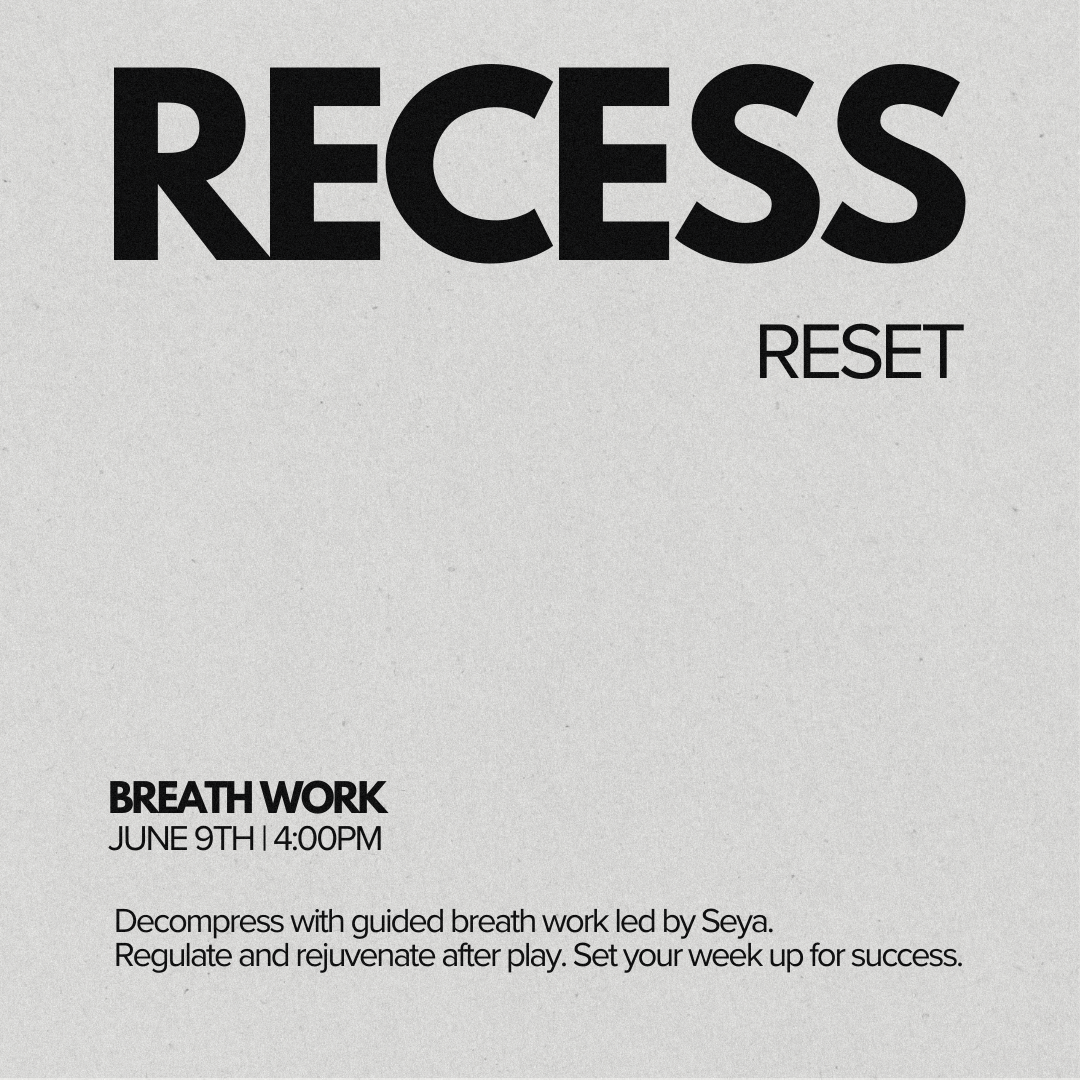
THE PLAYBOOK
A recurring monthly content series — each volume pairing imagery, typography, and prompts to make play a regular part of daily life. Three volumes. Consistent visual system. Evolving creative direction.
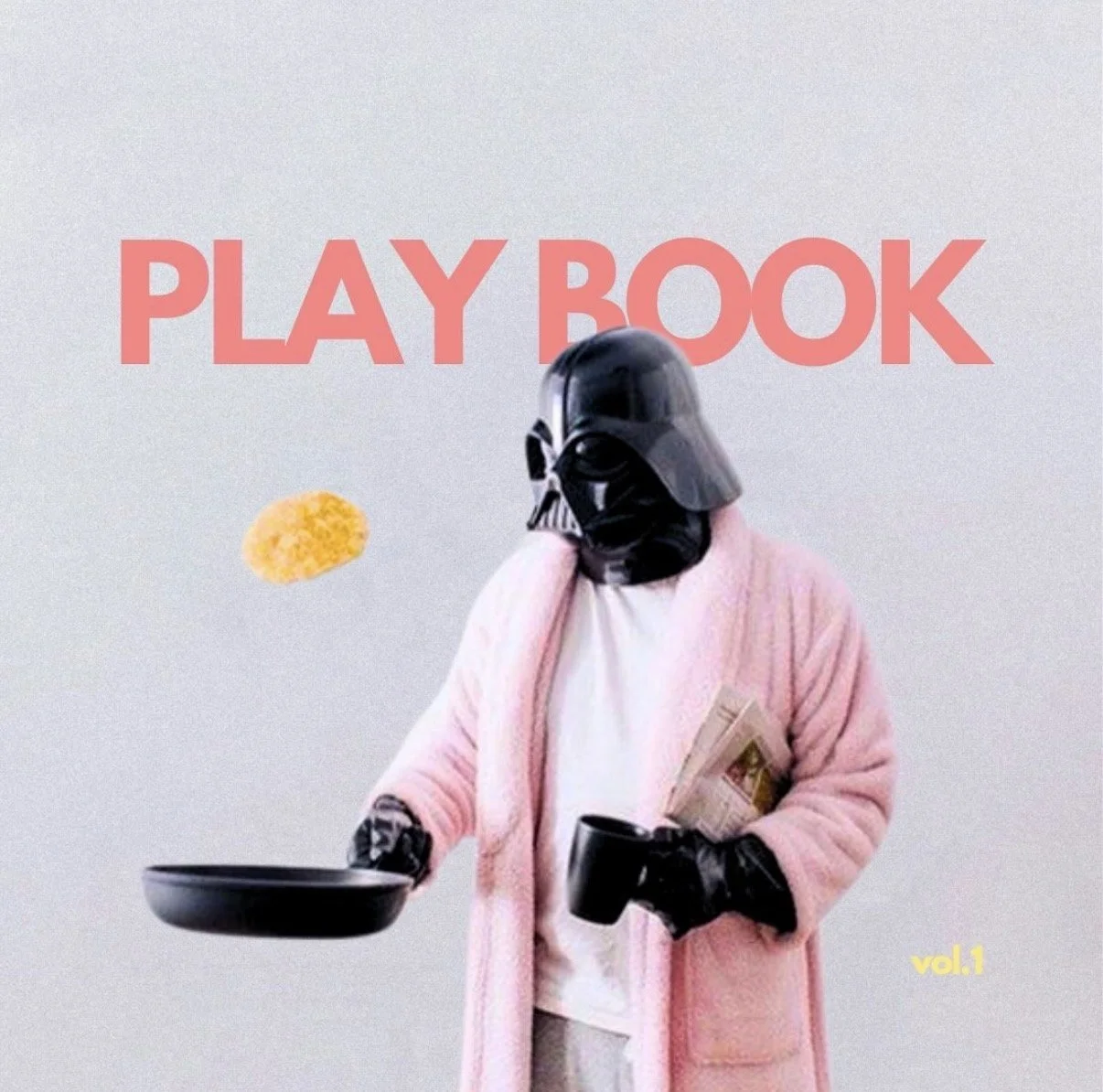
VOL 1.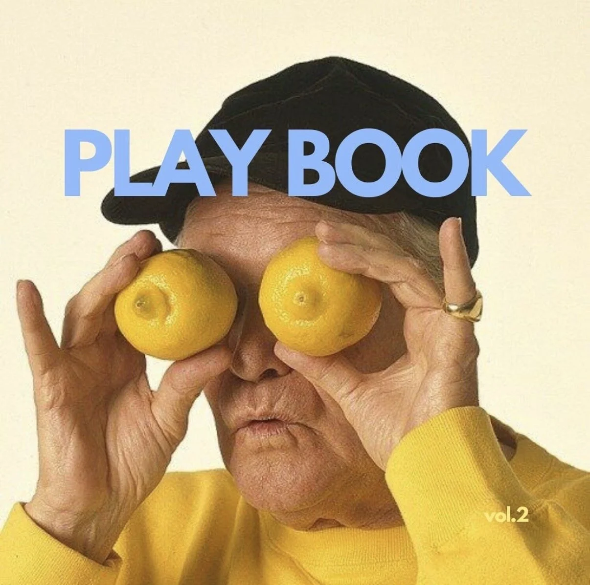
VOL 3.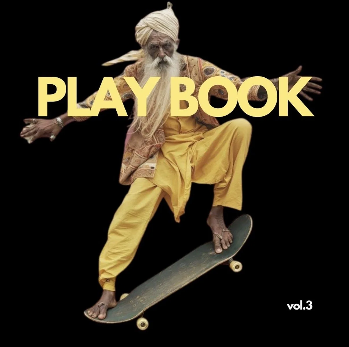
VOL 2.