Self-Originated · Editorial Publication
A publication by TIKA Studios.
Concept
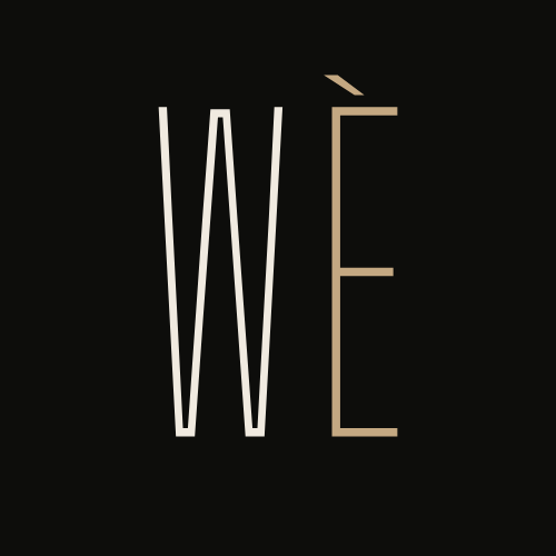
Wè is the Haitian Creole word for to see. It fit immediately. Community-rooted, personal, and exactly what the publication needed to mean.
Goal
Most coverage stops at what someone does. Wè stays until it gets to who they are.
Execution
Named, designed, and built the full visual identity and Issue 01 myself, start to finish.
The Visual System
Ink, Linen, Vermillion, Sand, Dust. A separate palette from the TIKA Studios site so Wè reads as its own publication rather than another page on the studio site.


Brand Book
Tone
Honest, not polished
Nothing forcefully posed. Movement over performance. A shape and a consistency that holds across every frame, even when the moment itself is loose.
Photographic Direction
Light as the director
Natural light leads the frame. Space is part of the composition, not something to fill. The eye moves from context to presence to detail.
Visual System
A separate identity, on purpose
TIKA Studios is the business. Wè is the publication. The color, type, and layout system exists so Wè reads as its own thing, not a page nested under the studio site.
The Publication